.svg)


How to Increase Revenue With an Efficient Ecommerce Checkout Flow

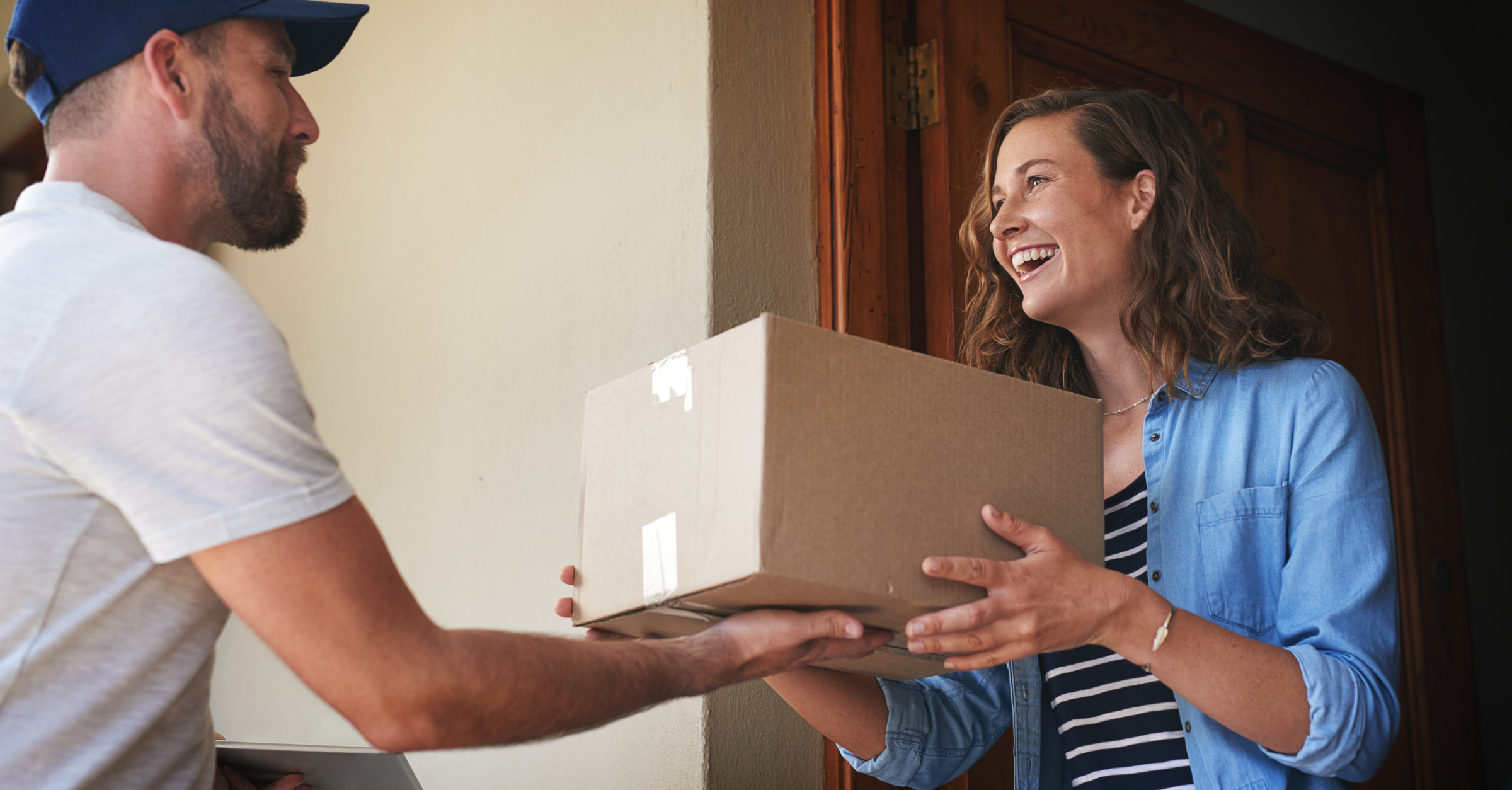
If a shopper doesn’t go through with a purchase, it’s easy to assume the problem is your product. You might think the product’s quality is too low or its features don’t align with what your audience wants.
But not all missed sales are about your product. The culprit could be a bumpy checkout experience. Shoppers interested in your product could easily abandon the checkout experience if there are too many friction points.
Even consumers with the convenience of saved payment information still experience issues. In PYMNTS’ research, 55% of shoppers with stored payment credentials reported they dealt with at least one checkout pain point over 12 months.
Luckily, there are simple fixes to keep your checkout experience smooth. Keep reading for tips on minimizing friction during checkout and encouraging shoppers to complete their orders.
What are the standard ecommerce checkout steps?
The checkout process typically involves the customer:
- Clicking the “Add to cart” button on product page(s).
- Reviewing their cart items and clicking the checkout button.
- Adding their shipping information.
- Adding their payment information.
- Reviewing and confirming their order details.
Shoppers who have set up an account on an ecommerce site can generally skip steps three and four and auto-fill their details instead.
Only ask for essential information
You might not think twice about asking a shopper for a personal detail in your checkout flow. But that seemingly simple request might rub customers the wrong way — especially if they don’t know why you’re asking for that information.
The UX research institute Baymard surveyed 2,800 online shoppers about details they won’t share in the checkout process. The top results were:
- Social Security number (87%)
- Passport number (83%)
- Date of birth (34%)
- Phone number (14%)
- Gender (12%)
Keep customers on your good side by only requesting the data you absolutely need to complete the transaction — their name, email, shipping address, billing address, and payment details. If you need one of the details mentioned in the Baymard Institute survey, leave a note to explain why you need that information.
The home decor brand Boutique Rugs places a pop-up note on their phone number text field to let shoppers know they’re asking for this detail in case there’s an order issue.

Without this note, customers might not complete a sale for fear of being spammed. The message reassures them, so they’ll likely move forward with the purchase.
Be upfront about charges on product pages
Here’s a common frustration experienced by today’s shoppers. Imagine you’re in the process of buying tickets to your favorite singer’s concert. At first, you’re excited because the tickets are a steal at $40. You submit your personal details, contact information, and payment data over the span of a few minutes.
Then you see the order review page: the ticket provider added two surprise $15 fees, so now those $40 tickets are actually $70. That’s over your budget, so you abandon your shopping cart.
Avoid misleading customers by being transparent about any fees on your product pages that may affect an order’s total cost. Place these details close to the price on each product’s page.
- Shipping charges: Let shoppers know the minimum they have to spend to get free shipping and your shipping rate for orders under that minimum. If shipping costs vary based on the buyer’s location, just note that shipping isn’t included in the product price.
- Product and shipping protection fees: Even if your protection plans are optional, list their prices on the product page so customers can gauge their order’s full cost if they want coverage. Consider also adding a pop-up information box that explains what these plans cover.
- Subscription charges: If your product requires a subscription plan — like a fitness membership to accompany an equipment purchase — list the monthly cost. And if you’re selling an annual subscription plan, let customers know its total cost (not just the monthly amount).
Encourage extra (relevant) product purchases
It might seem like suggesting products to customers at checkout is just a way to help your business, not the shopper. But when done well, these checkout recommendations make customers’ lives easier. You’re suggesting items they’ll enjoy, saving them another online shopping trip, and potentially helping them meet your company’s free shipping minimum if available.
But when done poorly, these recommendations are a source of frustration. A buyer is trying to get through the checkout process, but pop-up suggestions are slowing them down. And to top it all off, the items aren’t even a good fit for the shopper.
Keep your product recommendations during checkout helpful and smooth by considering placement and your basis for suggestions.
The cart review page is a non-invasive spot for recommendations on your ecommerce website. The main focus should still be the items the buyer already added to their cart, so place your suggestions underneath these products. The shopper can easily ignore the recommendations if they’re not interested. And if they want to buy the products, they can add them to their cart with just the click of a button — no need to leave the checkout process.
Your product recommendations also need to match shoppers’ preferences, so they’re helpful. Stick with suggesting items other shoppers bought along with the products in the buyer’s cart or items designed to be used with their purchases. A furniture brand, for example, might suggest a slipcover to a customer with a sofa in their cart.
Finally, give shoppers an extra nudge by showing how close they are to your free shipping minimum right next to your extra product suggestions. Customers might realize they’re better off adding a small product that gets them to the limit instead of paying the shipping rate.
Remind shoppers of your checkout perks
Online shopping may be an accepted norm at this point, but customers can still feel doubt about buying products they’ve never seen in person — especially if they’re considering big-ticket items. Show shoppers their order is worthwhile by showcasing the perks of buying from your company on your product and checkout pages.
These benefits might be free shipping, free returns, or buy-now-pay-later options. The eyewear brand Felix Gray lets shoppers know they can pay in installments on their glasses’ product pages.

Seeing these perks on product and checkout pages, customers will feel extra confident placing orders with your brand.
Offer flexible sign-in options
Retailers often make the mistake of forcing customers to create an account before making a purchase. The reasoning seems clear — the shopper will share their contact information so your brand can nurture them in the long run.
But customers are already submitting their email addresses through the checkout process, so nurturing doesn’t require an account. And at the same time, forcing account creation adds friction. Shoppers are trying to complete their orders as quickly as possible, so they may very well abandon ship if you ask them to spend several minutes creating an account.
Avoid losing customers by offering a guest checkout experience. Shoppers can purchase their products without creating an account — all they have to do is submit their name, email, address, and payment information. And because your team has their email, you can follow up after the purchase to ask customers if they’d like to create an account.
The beauty brand Glamnetic makes it easy for customers to check out by just asking them to enter their email address in lieu of creating an account. The company gives shoppers the option to log into their account near the email form field, but it’s not a requirement.

Another alternative to mandatory account creation is letting customers sign in through social and email accounts, especially Facebook and Google. Shoppers can log in within seconds, and their checkout process is fast because they can auto-fill form fields with account information.
Give a mix of payment methods
Chances are your shoppers own a debit or credit card. So why not make cards your only payment option?
While some customers are okay with manually entering their card details, many want the convenience of signing into a mobile wallet that auto-fills their details. Some buyers may also prefer mobile wallets because of their security features.
Include some or all of these popular mobile wallets in your checkout customer experience:
- Apple Pay
- Google Pay
- Samsung Pay
- Amazon Pay
- PayPal
If you offer these mobile wallets, encourage shoppers to sign in at the beginning of your checkout experience so their details are automatically filled into the form fields. The mattress brand Nectar highlights mobile wallets as “express checkout” options at the top of their checkout page.

To accept payments from mobile wallets, you’ll need to choose a compatible point-of-sale (POS) system.
You can also entice shoppers to complete their checkout by offering flexible financing, as consumers are increasingly using buy-now-pay-later (BNPL) options. According to Adobe, the share of BNPL transactions grew 14% in 2022, and BNPL revenue increased 27% over that same period.
The hair styling tool brand Tyme lets shoppers break up their purchases into four payments through the BNPL platform Shop Pay.

Knowing they can make several small payments, buyers who can’t afford to pay $111 at once for a styling tool are more likely to place an order.
Test checkout variations
It’s hard to guess which checkout designs will lead to the most orders. Some brands might have better luck with a few form fields on a multi-page checkout flow, while others see a higher conversion rate with a long single-page design. One business might encourage orders with product suggestions on their cart page, but another could get more sales from recommendations on the final checkout page.
The only way to find out what works for your brand’s checkout is experimentation. Use an A/B testing platform to show different variations of your checkout experience to shoppers and compare their performance. Create a reliable experiment by:
- Picking one metric to evaluate on each checkout design variation. For example, you could monitor the average transaction value or average quantity per transaction for each version.
- Changing only one factor at a time. Consider something like your “add to cart” button’s location or product suggestion placement. By changing only a single element, you’ll know what’s leading to different results.
- Showing your test to a large number of shoppers. Use HubSpot’s sample size calculator in its A/B testing kit to determine a sample size that will generate reliable results.
If you don’t already have an experimentation platform, check out HubSpot’s breakdown of top A/B testing tools.
Bring shoppers back with cart abandonment reminders
Even after you optimize your checkout flow with these tips, there still may be customers who leave before purchasing the items in their cart. That’s okay! You can still win them back with a cart abandonment email.
These messages typically include text like “Forget something?” or “You left something behind!” and an image of the abandoned product. The email’s CTA button takes shoppers back to their carts with text like “Keep shopping” or “Take me to my order.”
The email platform Klaviyo studied millions of abandoned cart emails to gauge how effective they are at bringing people back to online stores and generating sales. On average, these messages have a nearly 10% click rate and a cart recovery rate ranging from about 3% to about 5%. Klaviyo also found that higher-value orders had a greater recovery rate than low-value orders.
So if you send reminders to 100 customers who each had $100 orders in their carts, you can expect roughly 10 of those customers to return back to your ecommerce store (10% open rate) and $300 to $500 in recovered revenue (3 to 5% recovery rate). That’s a decent return from a cart reminder email — especially considering how you can automate these with an email marketing platform like Klaviyo.
Learn more about creating these emails and lowering your cart abandonment rate in this resource from Klaviyo.
Drive revenue at checkout with Extend protection plans
Your primary checkout goal is creating a smooth flow that encourages shoppers to complete their orders. But alongside that goal, you can also grow revenue by suggesting additional products during checkout — like product protection.
Extend Product Protection is a win for your brand and your shoppers. Buyers get peace of mind when they place orders, and your business reduces replacement costs and generates incremental revenue through product protection sales.
The portable blender company BlendJet increased its average order value by encouraging customers to add Extend Product Protection to their carts. Over a year, BlendJet’s product protection attach rate was 11.4%, and the company sold $500,000 worth of plans.
Want to offer product protection to your shoppers? Schedule a demo today.

Aaron Sullivan is content and copy director at Extend. He specializes in writing about e-commerce, finance, entertainment, and B2B SaaS.


.avif)


